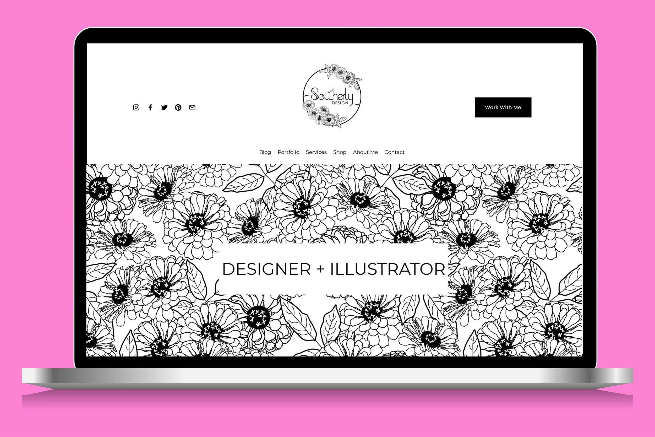
Southerly Design’s New Website: How I Overhauled My Website on Squarespace
Squarespace is an excellent platform to use when you are managing your own website and learning the basics of web design. It is user-friendly and customizable to your needs, perfect for artists and creatives looking to share their work online.
I overhauled my website last year right before my baby was born to utilize Squarespace’s new content editor and I am so happy with the result. This was the perfect time to switch over since I wanted to start blogging regularly. It’s a labor of love to maintain and update a website for a creative business, in addition to creating new designs, and it should be as enjoyable and user-friendly as possible! I am always recommending Squarespace!
Fluid Engine Feature in Squarespace Version 7.1
I updated my Squarespace website from version 7.0 to version 7.1 last year, in favor of the Fluid Engine feature only available to version 7.1. This new feature makes it even easier to maintain your website, in addition to other business needs and tasks.
When editing in the backend of Squarespace, a grid pops up to allow you to drag and drop images, text boxes, and buttons. This is one of the best features of Squarespace if you ask me. Fluid Engine’s grid is not accessible in templates that use Version 7.0, the main reason I updated.
Fluid Engine grid in Squarespace
Start a Squarespace Trial
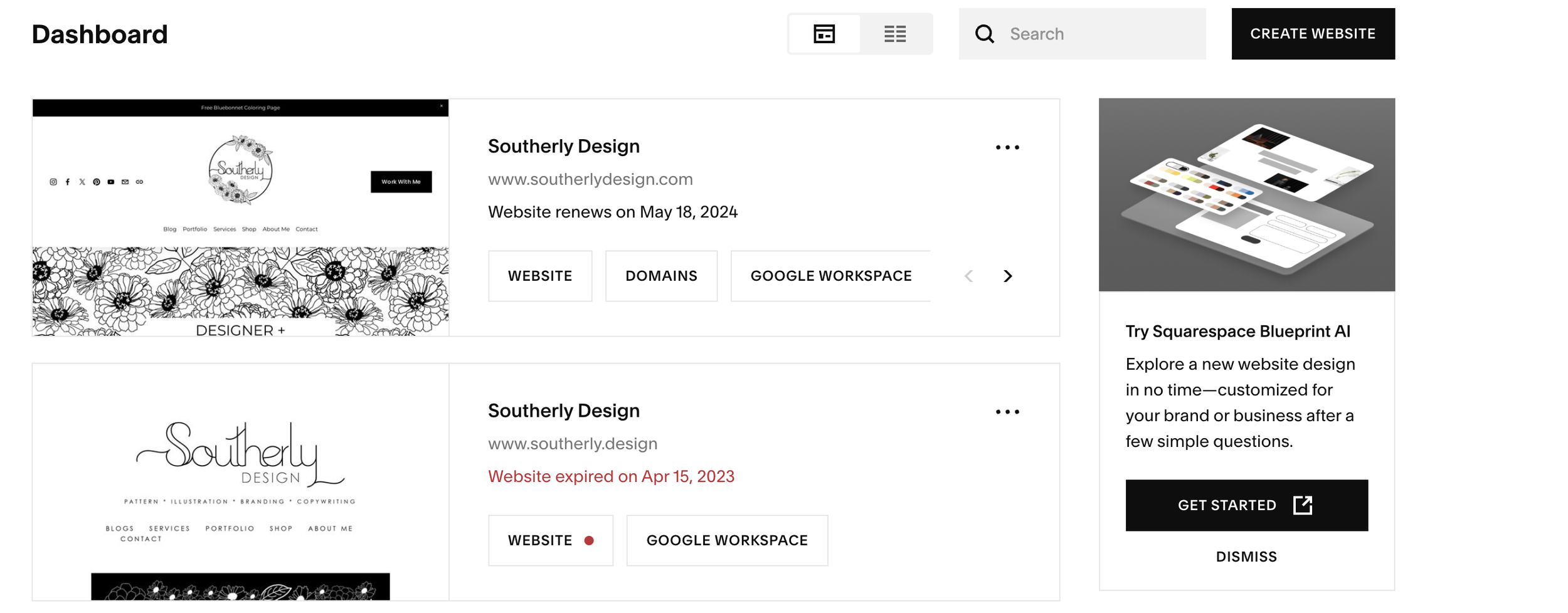
I updated my site manually by creating an entirely new website. Squarespace allows you two weeks for a trial website, and then you can upgrade to a paid site. This allows you to test if you like the platform. When viewing your dashboard in Squarespace, click CREATE WEBSITE to get started with a template.
Squarespace Dashboard
Updating to Squarespace Version 7.1
I downloaded all images from my old website, copied and pasted blog posts, and then uploaded everything into my new website. While this was a bit tedious, it helped me understand how the new editor worked in Squarespace. The old website did not have a home page that showcased everything I wanted, which made it a bit obsolete. The home page is akin to the table of contents for your website as it should showcase each part of your website, and link directly to other pages on your website. I feature my blog, my design services, my fabric store, and my pattern collections.
Follow along for more web design tutorials and tips for maintaining your website!


